CASE STUDY
A Refresh for Michigan’s Oldest Environmental Justice Organization
The Challenge: Helping an Environmental Justice Organization Celebrate Its Roots and Look Ahead
After celebrating its 20th anniversary, Detroiters Working for Environmental Justice was ready to realign its identity. The organization was getting ready to launch the first ever Detroit Climate Action Plan, a multi-year and multiple stakeholder project that would draw significant attention to the organization. The time was ripe for a bold move that would help the organization reach its goals and invite a new generation of supporters.
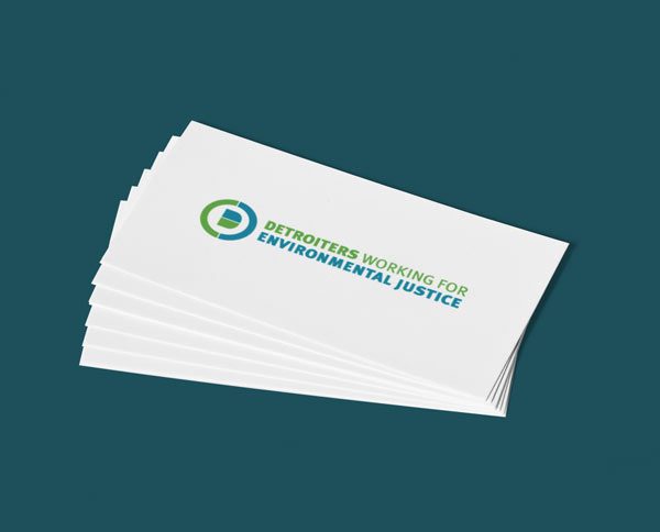
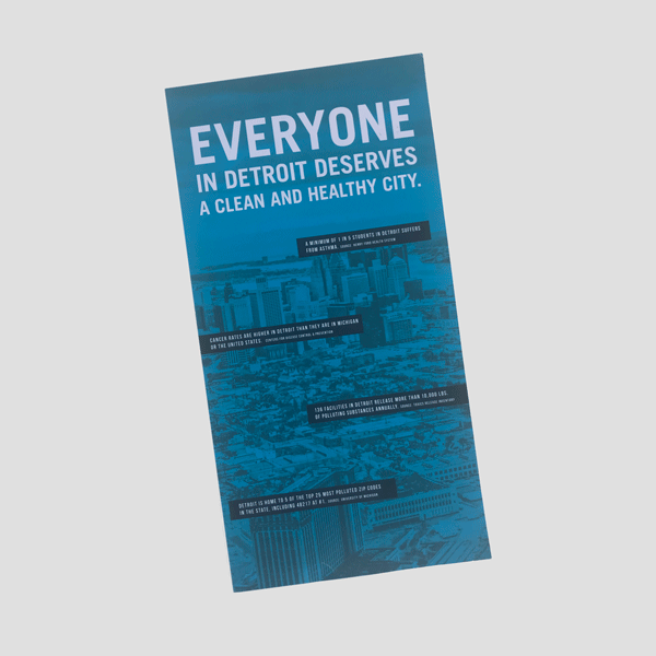
Detroiters Working for Environmental Justice hired us to develop a new logo, website, business cards, and letterhead. They collaborated with us to create a modern and clear aesthetic for their reports and publications.
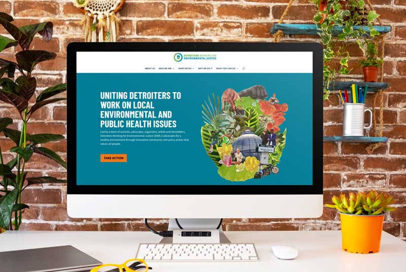
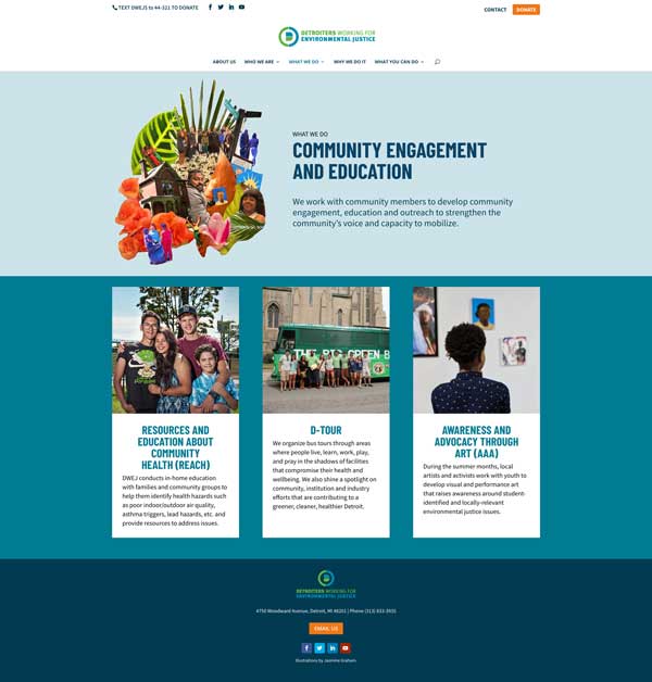
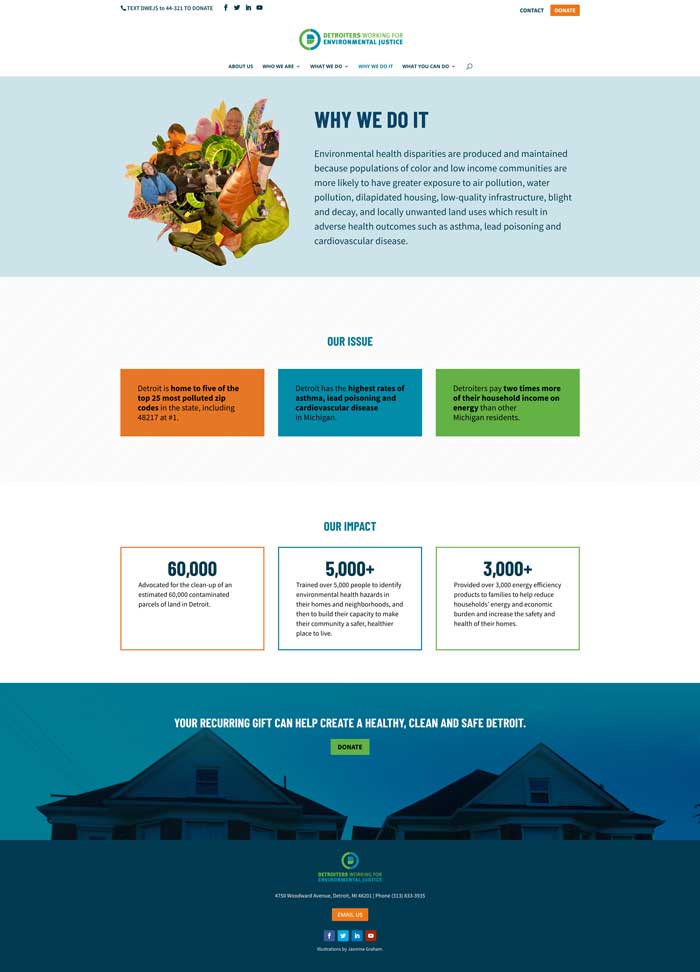
In 2023, DWEJ reached out to us again, ready to move to phase 2 of their website: growing an emphasis on urgent action and activism. We refreshed the site with a new crisp aesthetic and lush collaged illustrations commisioned from Detroit artist Jasmine Graham.
CLIENT
Detroiters Working for Environmental Justice
Detroit, Michigan
SCOPE OF WORK
Discovery & Strategy
Site Structure
Art Direction
Copy (by Lara Zielin)
Infographics
Site Design and Development
Print Design
SITE
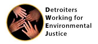
The logo we were hired to replace.
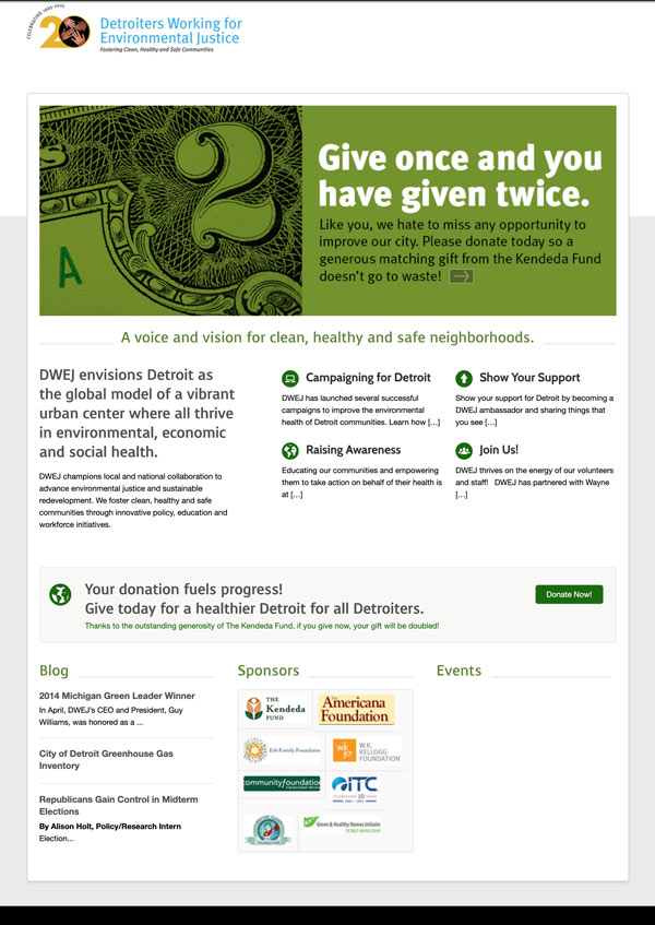
The website was a template that was difficult to customize. Without photography, it lacked a sense of the people and community that the organization works to protect.
Process
Through interviews with the Executive Director and staff, we identified several challenges. We discovered that most citizens had a minimal or nonexistent understanding of environmental justice. In addition, their logo, which had been used since the organization’s inception, four hands of varying skin tones, spoke to the idea of diversity and people of color but didn’t evoke the context of environmental issues to the general public. Without that key understanding, many might struggle to understand what the organization did. And, because it relied on four color printing and photography, it wasn’t easy to reproduce aor flexible enough to print on a t-shirt for example.
We researched the environmental justice movement, grew to understand the intentions of the founders, and did an analysis of the language and messaging that had been used in the past. We were curious about the name. We wondered, why not “Detroiters for Environmental Justice”? Through our research and interviews, we realized that through the lens of the founders (which included activist Grace Lee Boggs), the emphasis on the concept of “Working” is an acknowledgement to the need for ongoing activity and effort, as well as a nod to the struggles of class and the labor movement.
Our goal became clear: to create a logo and identity that would help Detroiters Working for Environmental Justice communicate more clearly, and to support their important work through their next phase of growth.
We worked with Detroiters Working for Environmental Justice to identify the concepts that would be at the heart of the logo: the city of Detroit, natural world, security/safety and equality. We wanted to avoid iconic images of the Detroit skyline in the logo— though Detroit is often represented that way, the landscape includes many neighborhoods and areas beyond downtown. We chose colors that are organic but optimistic and energetic and forward-looking.
Showing real people and sharing their stories was key to communicating the connection between the people of Detroit and the environment. Photographer Leisa Thompson created environmental portraits of Detroiters who are allies and collaborators with the organization— at home in their neighborhoods, showing both natural land and cityscapes.
Results
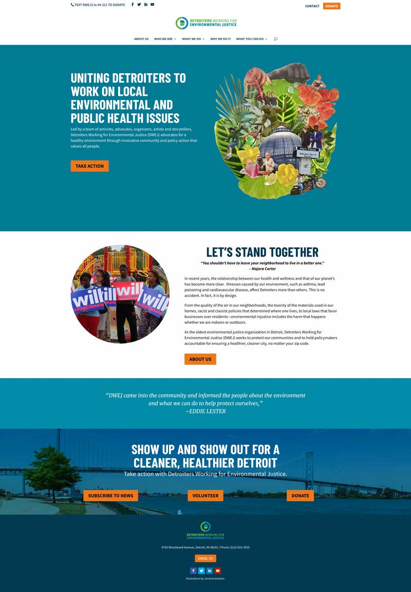

Photograph: Leisa Thompson
Copy: Lara Zielin, Bold Type Copywriting
Web illustrations by Jasmine Graham
